Today is a big day! We’re excited to release Doctave 2.0: our biggest and most ambitious release to date and we can’t wait to show you everything we’ve built.

This update brings with it a number of exciting features and improvements:
- An improved modern design
- A more customizable theme
- A brand new powerful component system
Design
Documentation sites on Doctave look better than ever with this design update.
A picture tells a thousand words, so I’m going to let screenshots do most of the talking here.
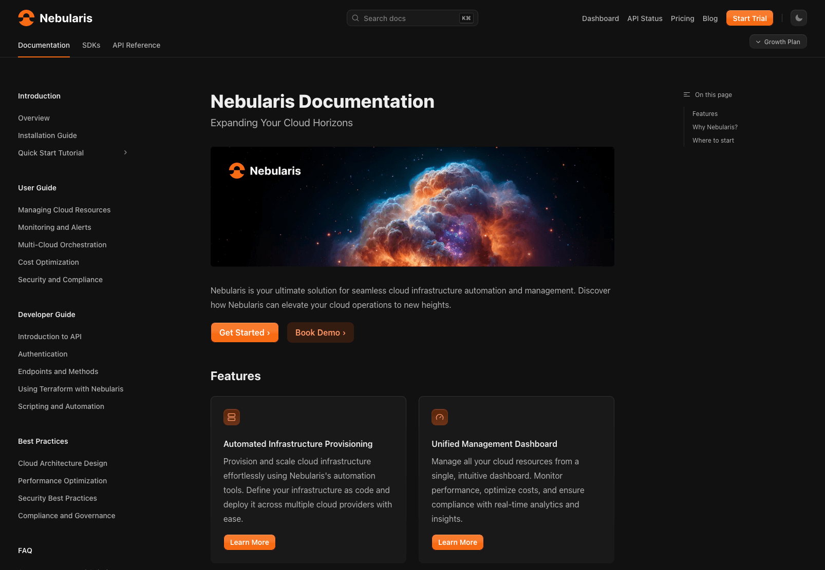
The familiar Doctave layout. Redefined.
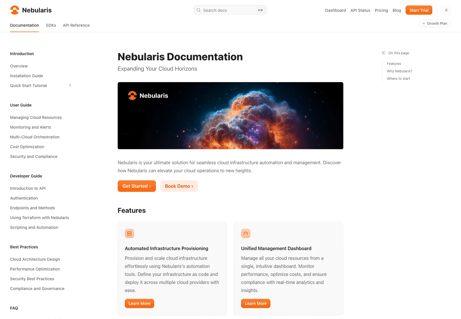
Every theme works in both light and dark mode without any additional configuration.
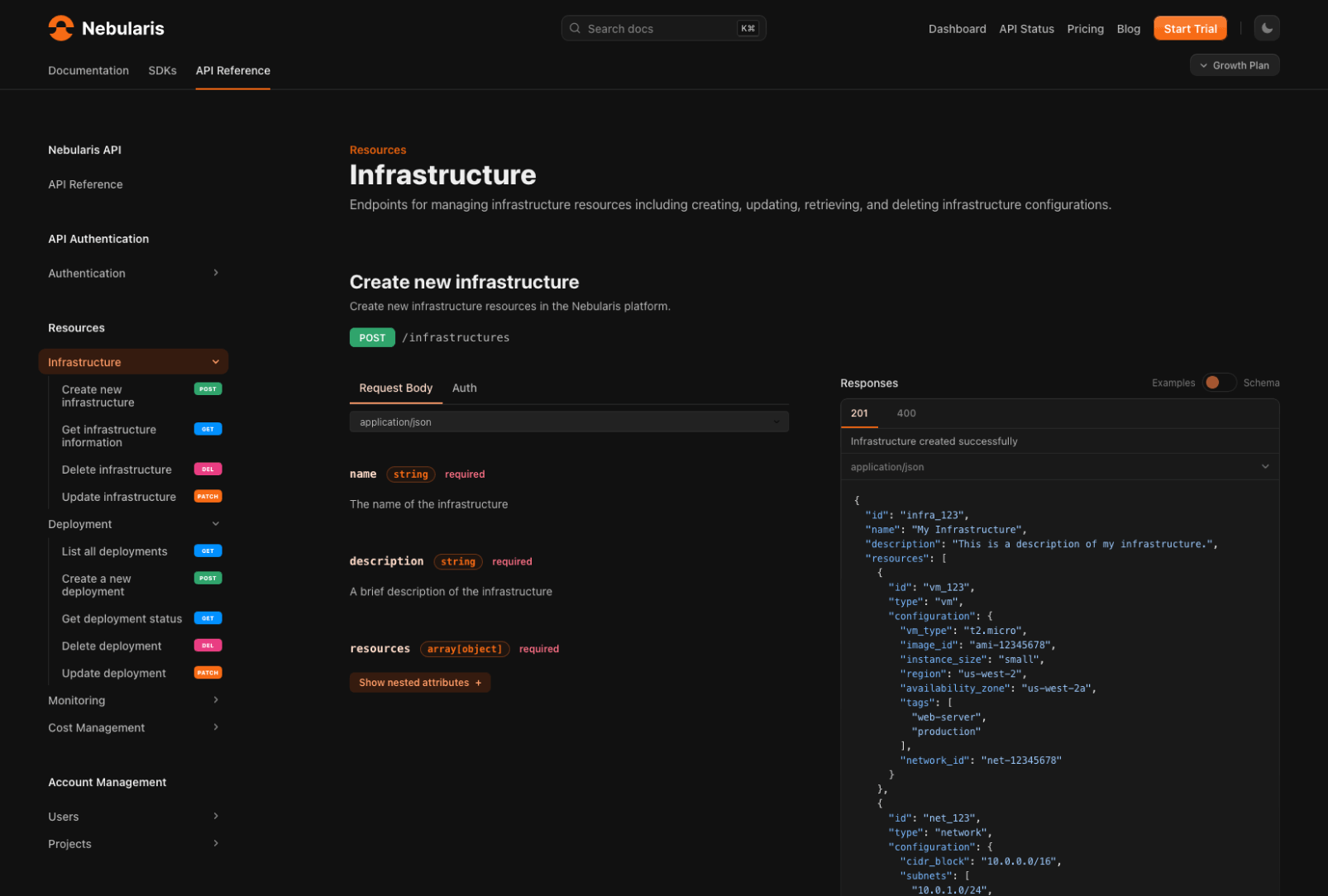
OpenAPI specs have also been redesigned to match the new theme
Customizable theme
Doctave 2.0 computes a 12-point color scale based on your brand color and chosen grayscale. The theme will work with any color scheme with 2 lines of configuration.
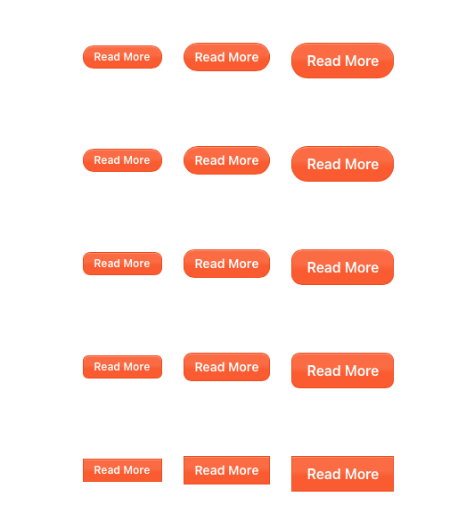
But you can go further than just customizing colors! You can configure the border radius of the design to match your brand:
All this is configurable in your doctave.yaml project file with just a couple lines:
1
2
3
4
5
6
7
8

title: Nebularis Documentation
doctave_version: 2

theme:
  radius: medium
  colors:
    accent: "#fa5b30"
    grayscale: mauve
And we’re not stopping there. Expect more configuration options in this space! 👀
Component System
One of the things we kept hearing from customers is authors wanting to go beyond basic Markdown features. Beyond just prose, writers also want to be able to create compelling landing pages, galleries, and call-to-actions.
After lots of iteration and unsatisfactory prototypes, and are excited to reveal our brand new component system! It allows you to:
- Use a library of pre-built, composable UI components
- Easily build your own reusable components from our building blocks
- Drop down to custom HTML/CSS when needed
We’ve taken inspiration from many different template and component systems such as MDX, Markdoc, and Radix, and created a system specifically designed for documentation and Markdown.
UI components
You’ve already seen a number of UI components in the screenshots above, like the buttons in the border radius section.
Want to render a call to action button?
1

<Button size="lg" href="/">Read More</Button>

Or installation instructions for different operating systems?
1
2
3
4
5
6
7
8
9
10
11
12
13
14
15
16
17

<Tabs>
    <Tab title="macOS">
    ```bash title="Install Nebularis CLI on macOS"
    brew install nebularis-cli
    ```
    </Tab>
    <Tab title="Linux">
    ```bash title="Install Nebularis CLI on Linux"
    curl -fsSL https://nebularis.com/install.sh | sh
    ```
    </Tab>
    <Tab title="Windows">
    ```bash title="Install Nebularis CLI on Windows"
    iwr -useb https://nebularis.com/install.ps1 | iex
    ```
    </Tab>
</Tabs>
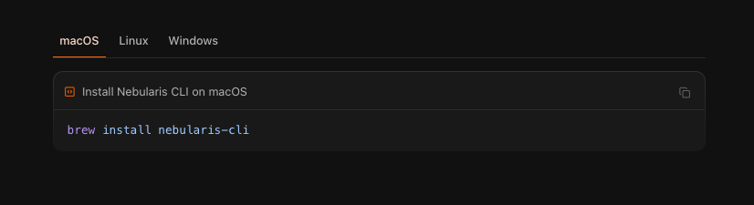
Note how the Markdown content fits right in between the component tags.
Doctave comes with a whole library of components from steps, tabs, multi-language code blocks, and much more!
Combining components
One thing we wanted to make sure was that our components were composable. Meaning you can combine them in interesting new ways and have them work together.
Let’s say I want to have some cards on my landing page that direct users to most commonly read articles. How can I achieve that with Doctave?
By combining multiple components together!
1
2
3
4
5
6
7
8
9
10
11
12
13
14
15
16
17
18
19
20
21
22
23
24
25
26
27
28
29

<Grid cols="2" gap="3">
  <Card>
    <Flex justify="between" gap="2" height="full" dir="column">
        <Box>
            <Icon set="lucide" name="server" variant="boxed" color size="md" />

            #### Automated Infrastructure Provisioning

            Provision and scale cloud infrastructure effortlessly using Nebularis's automation tools. Define your infrastructure as code and deploy it across multiple cloud providers with ease.
        </Box>

        <Button href="/provisioning.md">Learn More</Button>
    </Flex>
  </Card>

  <Card>
    <Flex justify="between" gap="2" height="full" dir="column">
        <Box>
            <Icon set="lucide" name="gauge" variant="boxed" color size="md" />

            #### Unified Management Dashboard

            Manage all your cloud resources from a single, intuitive dashboard. Monitor performance, optimize costs, and ensure compliance with real-time analytics and insights.
        </Box>

        <Button href="/dashboard.md">Learn More</Button>
    </Flex>
  </Card>
</Grid>
This gives you:

The grid is responsive, everything respects your theme, and you can include arbitrary Markdown inside your components. And this is just one of a countless number of ways you can combine Doctave’s components together.
Custom components
But maybe you have a very specific UI element you want to create. Perhaps a callout with some custom CSS. Doctave supports this too.
1
2
3
4
5
6
7
8
9
10
11
12
13
14
15
16
17
18
19
20
21
22

---
attributes:
  - title: heading
    required: true
    type: text
  - title: variant
    required: false
    default: "info"
    validation:
      is_a: text
      is_one_of:
        - "info"
        - "success"
        - "warning"
        - "error"
---

<div class="custom-card" data-variant={@variant}>
  <p class="custom-card-heading">{@heading}</p>

  <slot />
</div>
This is a custom component that expects as argument a heading and an optional variant, and accepts arbitrary Markdown (or other components!) as child elements through its <slot />.
You can now render this component anywhere in your documentation:
1
2
3
4
5

<Component.CustomCard heading="Getting Started" variant="success">
  To get started, follow along with out tutorial

  <Button href="/tutorial">Tutorial</Button>
</Component.CustomCard>
This allows you to create your own library of components, building on top of Doctave’s primitives, or entirely with your own CSS.
Authoring experience
We spend a lot of time thinking about the authoring and developer experience with Doctave, and one thing we put a lot of effort into on this release is error messages.
We’re proud to say that Doctave’s component system has some of the best error messages in the business.
To demonstrate, let’s see what happens if you try to pass in an argument to a component that it isn’t expecting:
1
2
3
4
5

Unexpected value. Found `happy`, expected one of info, success, warning, error

    4 │
    5 │ <Callout type="happy">
                       ▲▲▲▲▲
Or what about if you misspell a closing tag for your component?
1
2
3
4
5
6
7
8
9
10

Unexpected closing tag `</Callour>`, expected corresponding closing tag for `<Callout>`

    4 │
    5 │ <Callout type="success">
        ▲
        └─ Opening tag
    6 │     Fantastic! You're successfully installed the CLI
    7 │ </Callour>
        ▲
        └─ Expected close tag
What’s next?
We will be expanding our component library and adding more customization options for your themes in the coming months.
Look forward to more layout choices, more theme variants, and more new UI components.
In the meantime, take Doctave 2.0 out for a spin! You can sign up (for free - no credit card required) here.
Happy documenting!
Nik & Anton, Doctave Founders
Articles about documentation, technical writing, and Doctave into your inbox every month.